Color Voodoo for the Office
A guide to creating a work space where mind and body function at their best
Minimize optical fatigue, maximize productivity, and create spaciousness by tapping the power of color.
Immediate download for this e-book
$14.99 - Find out more below!Color Voodoo for the Office
If you’ve ever wondered if your office is casting a spell on you, this e-book will provide the answers. “Color Voodoo for the Office” provides guidelines for assessing your work environment and using color to enhance your sense of well being, maximize productivity, and minimize stress and fatigue.
It is an indisputable fact that satisfaction with the work environment is closely related to job performance. This guide will show you how to tap the power of color to create a work space where mind and body function at their best!
This e-book is a PDF. You can read it it on any tablet, mobile device, or computer.
What’s included:
The worst colors for offices
The best colors for offices – such as colors for peace and quiet, wakefulness, focus & being organized
How to use color to create spaciousness
Lighting Tips
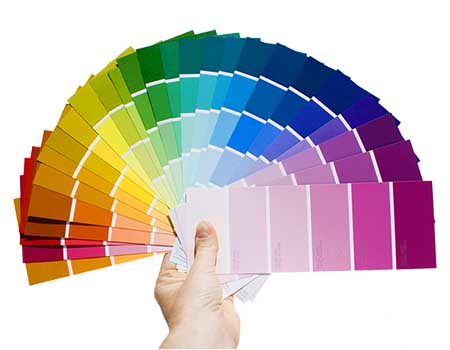
How to select a color from a paint chip

Choosing the right color scheme is the first step. However, selecting the right color of paint, wallpaper, or carpet – a color that will deliver the desired results – is not so easy. All too often, a color that looks ideal on a small paint sample explodes into a different color when you apply it to a wall. A subdued light champagne yellow paint color may turn into a screeching sour lemon yellow on the walls, an olive carpet winds up brown, and a very light tint of any paint color turns out white. “Color Voodoo for the Office” includes a full section of guidelines for color predictability for furniture, paint, wall covering and flooring.
Here are some questions that this e-book answers:
Does your favorite color matter? How important is personal preference when designing a productive work environment?
Can colors raise your blood pressure? Can colors calm you? What’s the story behind “Drunk Tank Pink?”
Is your office is too hot or too cold, too dry or too damp? Can the right colors alter your experience of the environmental factors?
What’s the most irritating color for any critical task environment? What’s the most restful color for the human eye?
Our customers write:
“I want to tell you the book “Color Voodoo for the Office” was VERY useful in designing my new recording studio. I have done a few sessions and people are happy, positive, creative and don’t burn out fast. All the things I wanted when I got your book to assist the design process and the color schema for the studio. Merci votre equipe.” … David Donald,France
“I’m so impressed with “Color Voodoo for the Office.” The content is just what I needed. I’m designing a new office space in a building that has historic qualities. Also, it’s great that it’s easy to read on my screen.”…Michelle Robinette Ed.S.
More

A newly revised section covers office color schemes based on 12 colors: red, orange, yellow, brown, green, blue-green, green, blue, purple, black, white and grey. A description of the advantages and disadvantages of specific shades of each color is also included. Illustrations show how to use the colors to create a dynamic effect … or a softer and quieter effect. Easy to use instructions explain how to use these colors on walls, floors and furniture and which accent colors work best.
A little background about how the book came into being: The information is based on the author’s courses on color and interior design at the University of Hawaii School of Architecture and Chaminade University. “Color Voodoo for the Office” is written in understandable terms so that the general public may apply and benefit from the information. Since the e-book is s PDF, you’ll be able to download it immediately.
Looking for more?
Sensational online courses from Color Voodoo author Jill Morton: "Foolproof Color Formulas for Interior Design" and "Color Harmony for Your Home"
Click here!
